Customer storefront walkthrough
Where it appears
The configurator runs wherever you added the Solar Configurator theme app block, usually on a dedicated page such as "Design Your Solar System". The page shows a progress bar across the top, with an icon on each of the module steps, and the wizard below it. Steps the customer has finished are clickable and carry your secondary color, brightening on hover; every step change scrolls the wizard back to the top. Once the customer reaches the first module step, a live bill of materials sidebar appears on the right on wider screens.
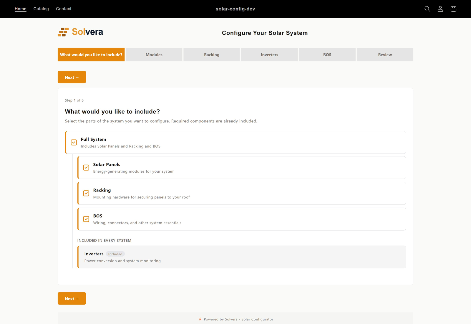
Step: Choose Components
If you set one or more modules to "Customer chooses", the wizard opens with a component selection screen. The customer sees:
- A Full system / Choose components switch when more than one module is selectable. Full system selects everything; Choose components lets the customer tick the modules they want.
- Selectable modules (for example Solar Panels and Racking) as cards with checkboxes and a module icon.
- Always included modules (for example Inverters) as cards with an "Included" badge and a locked, checked checkbox.
Unchecking a module removes its step from the wizard straight away: the progress bar loses that tab and the step count drops, so a customer who does not need balance of system parts is never asked about them. Re-checking it puts the step back. The helper text beside the switch changes with the mode, reading "All four included" under Full system and "Uncheck anything you already have" under Choose components.
If all your modules are "Always included", this step does not appear and the customer starts directly with the first module.
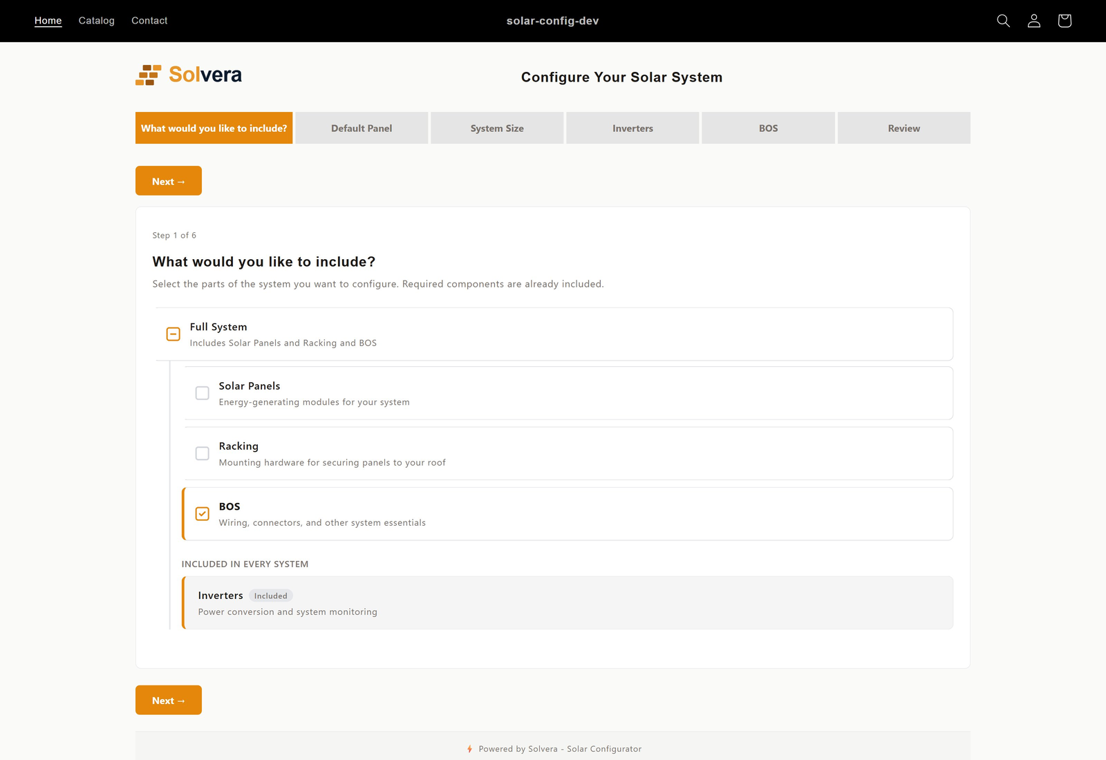
Step: Solar Panels
- A filterable product grid shows your panels with live images, prices, and availability pulled from Shopify.
- Cascading filters (wattage, manufacturer, color, plus any custom filters you defined) narrow the list.
- Panels with a minimum order quantity show a "Min. order: N" pill under the product name.
- The customer selects a panel, then sets the number of arrays and rows, and the panels per row with orientation (portrait or landscape).
- If you added a custom sub-module under Solar Panels, its questions and product grids follow at the end of this step.
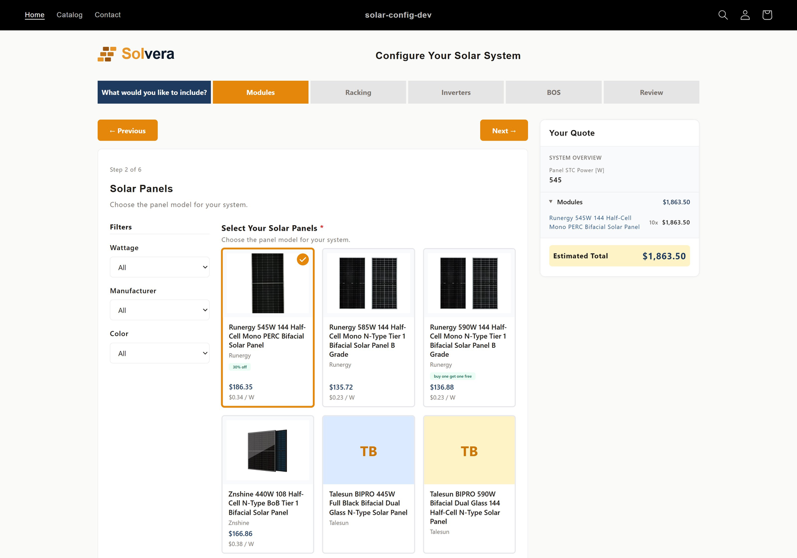
Step: Racking
- The customer picks a mount type (pitched roof, flat roof, or ground mount) using image cards. Only mount types that are checked in Module Selection and have products are offered. If you have added a custom racking sub-module (for example Carport), it appears here as an additional mount type card.
- Follow up questions appear based on the choice:
- Pitched roof: roof type, metal profile, roof attachment.
- Flat roof: ballasted, tilt legs, or metal roof subtype, offering only the systems you checked and stocked.
- Ground mount: architecture family, pile or pole details, wind and snow load, tilt angle.
- A custom mount: the standard racking questions (minus any you chose to hide) plus the sub-module's own questions.
- Manufacturer, rail profile, rail color, and clamp color selections cascade so only compatible options appear.
- For ground mounts, pier spacing is calculated automatically from engineering tables and shown to the customer.
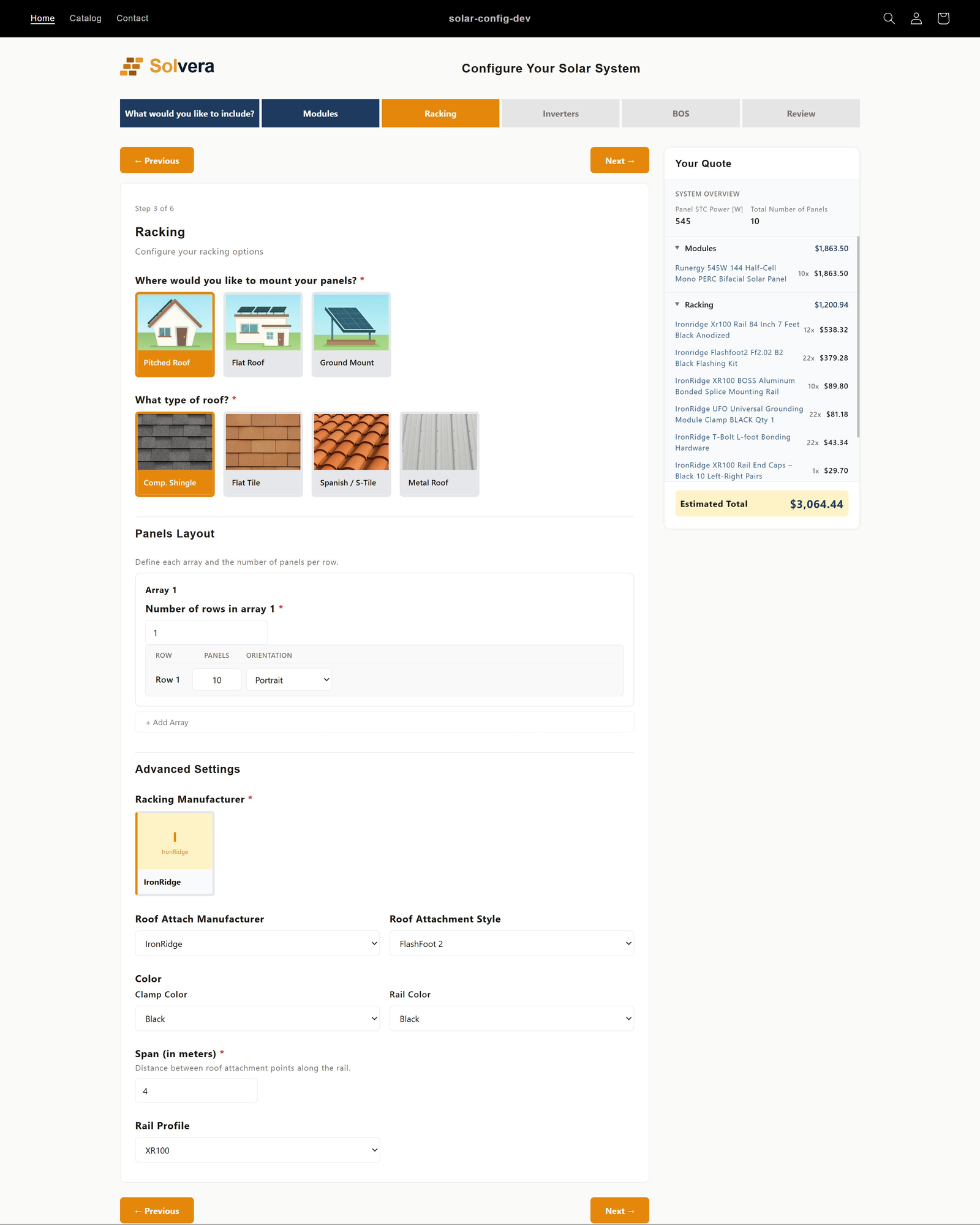
When Solar Panels or Racking are not included
Not every store sells panels and racking. The configurator adapts when one of these modules is turned off, or is set to "Customer chooses" and the customer opts out. In place of the normal step, it shows a lightweight fallback so the bill of materials still has the information it needs.
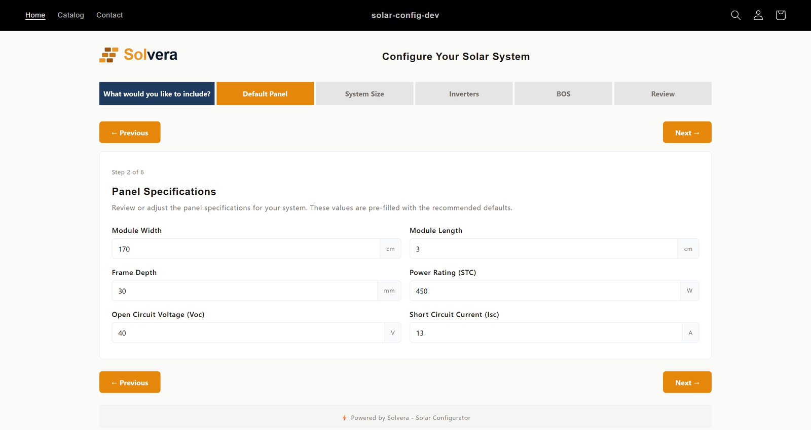
Default Panel step (when Solar Panels is not included)
The racking and inverter calculations still need basic panel specifications. When you do not sell panels, you enter default panel values once in the admin. Then on the storefront:
- If you make those defaults visible to customers, the wizard shows a Default Panel step with editable fields (such as module dimensions, power rating, and electrical characteristics), pre-filled with your defaults. The customer can adjust them.
- If you keep the defaults hidden, no step appears and your values are used silently in the background.
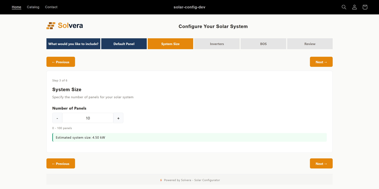
System Size step (when Racking is not included)
When you do not sell racking, there is no roof layout to derive the panel count from, so the wizard shows a System Size step instead. The customer sets the number of panels with a stepper, within the minimum, maximum, and increment you configured. You can add an instructional note, and optionally show the calculated system size in kW as the customer changes the count.
Step: Inverters
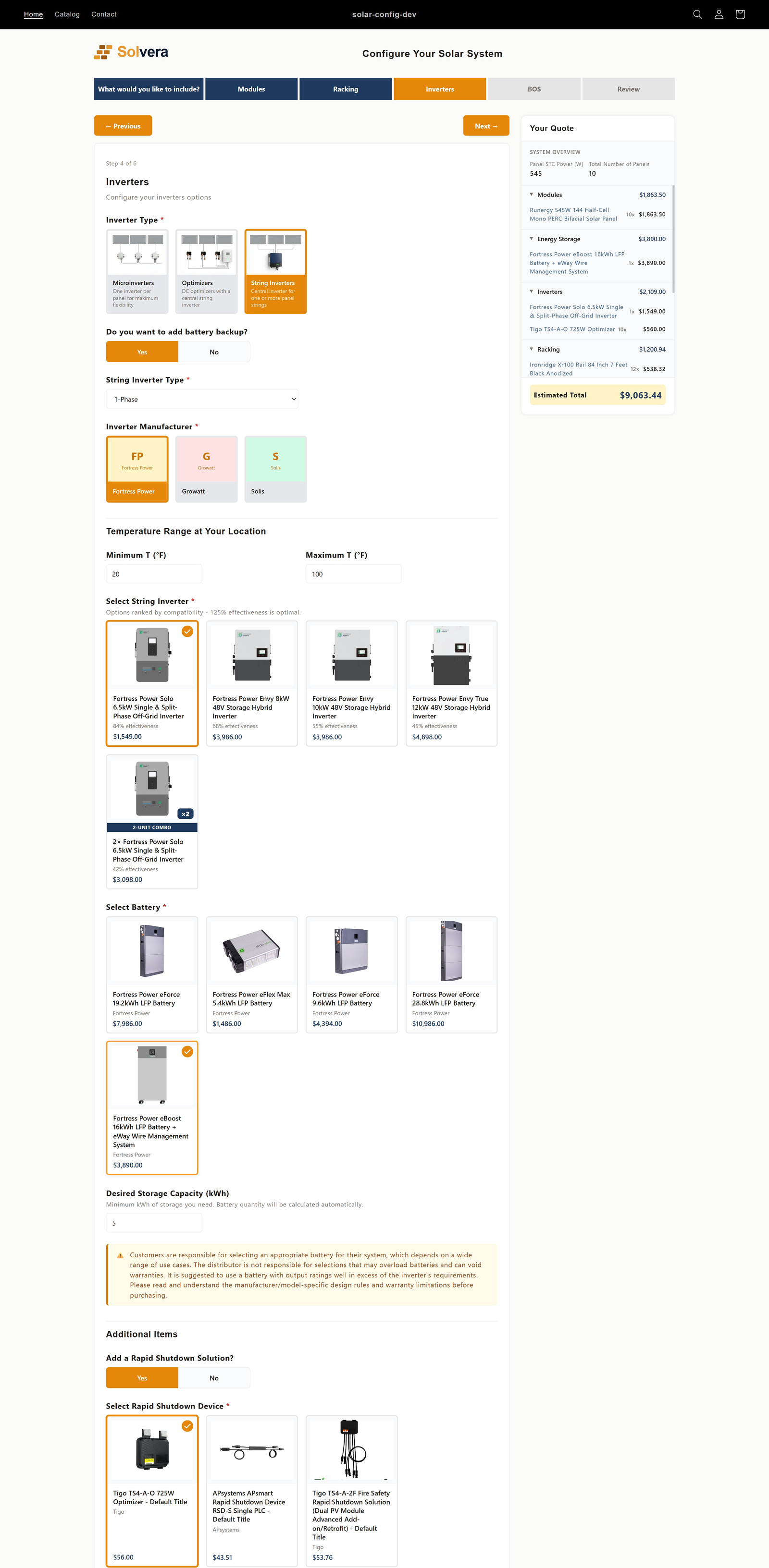
- The customer chooses an inverter type: microinverters, optimizers (DC optimizers with a central string inverter), or string inverter. Only the types you checked in Module Selection and have products for are offered.
- For microinverters, the list is filtered for cold weather voltage compliance, and the customer can add an optional battery.
- For string inverters, the customer answers battery yes or no and phase type, and the system suggests correctly sized inverters, including stacked "2-Unit Combo" options when appropriate. The number of DC strings, and with it the fuses and combiners, follows from the inverter's max input voltage and the panel's cold weather Voc; see String sizing. On the string inverter path the customer can also add a rapid shutdown solution.
- Battery options are filtered for compatibility. The battery questions appear only when Batteries is checked under Inverters in Module Selection and you stock one.
- On any inverter path, when the merchant has a monitoring unit compatible with the customer's picks, the step asks "Add a monitoring system?" and then offers a Monitoring System picker with only the compatible units. Which units count as compatible is set per product; see Monitoring devices.
- A custom sub-module under Inverters adds its questions and product grids at the end of the step, once the inverter type is chosen.
Merchants can also hide any of these sections, or a built in question, under a condition on an earlier answer, for example no monitoring on microinverter systems. See Visibility rules.
Step: Balance of System (BOS)
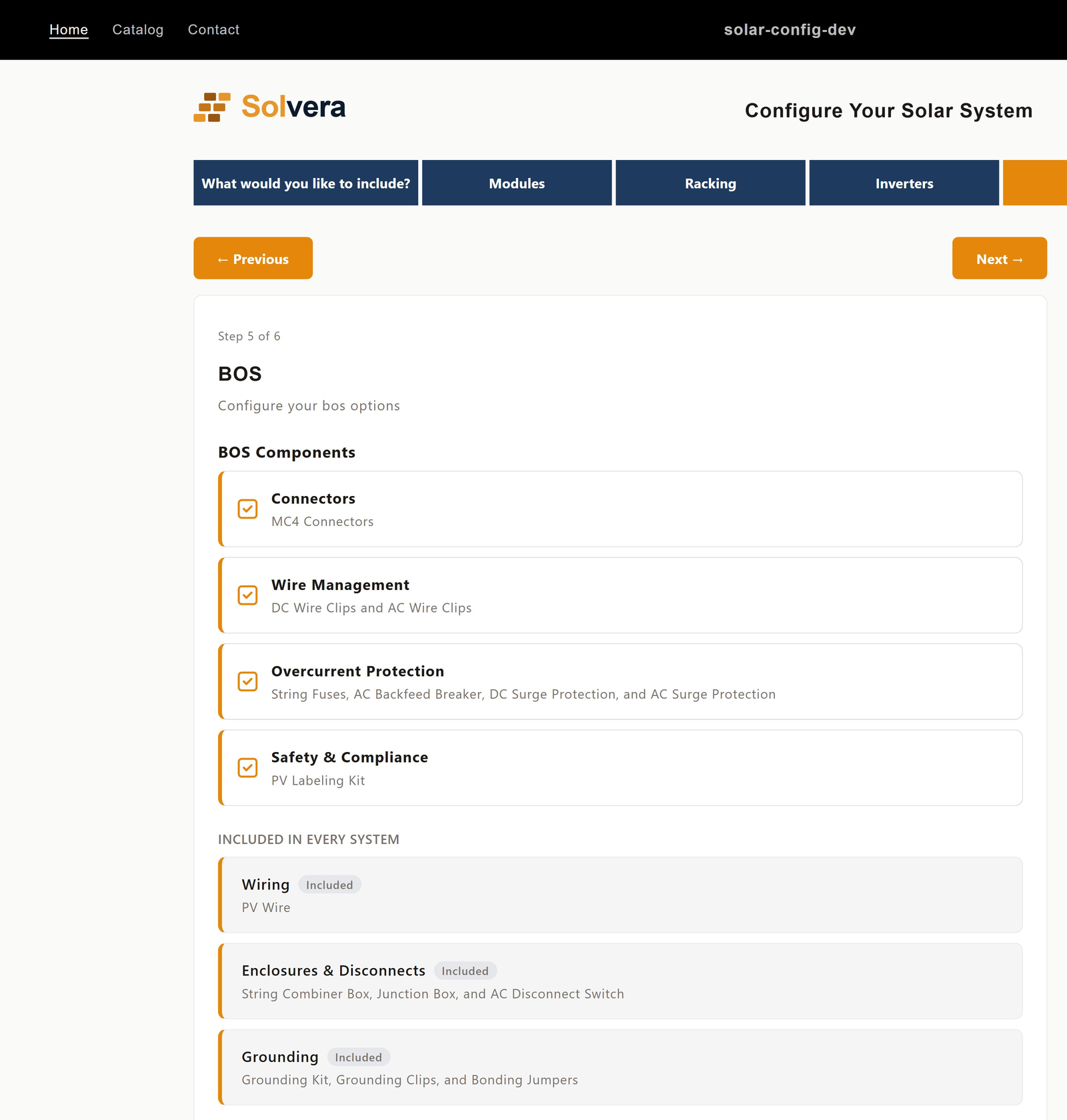
- Categories you set to "Always included" appear under Included in every system as cards with an Included badge and no checkbox.
- Categories you set to "Customer chooses" appear as checkboxes the customer can toggle. A category arrives unchecked when you untick Selected by default on its category card; checking it adds its items to the quote, and unchecking it removes them again. A category that only appears later, after the customer changes an earlier answer, arrives in its default state too. A custom EV charger item assigned to the EV Charger category gets its own checkbox here.
- A category whose Include rule is not met for this system does not appear at all.
- Wiring, connectors, and grounding are resolved automatically based on the system the customer configured.
- Each category card carries an icon that you can replace in Edit Mode.
- A custom sub-module under BOS adds its questions and product grids after the category cards.
Step: Custom modules
If you added a custom top level module (for example Electrical Panel), it appears as its own step in the wizard, positioned according to the order you set. The customer answers its questions and selects from its product grids just like a built in module. Custom sub-modules are different: under Racking (a Carport, say) one appears as a mount type option inside the Racking step, and under Solar Panels, Inverters or BOS its questions and grids are appended to that module's step. Neither gets a step of its own.
The live BOM sidebar
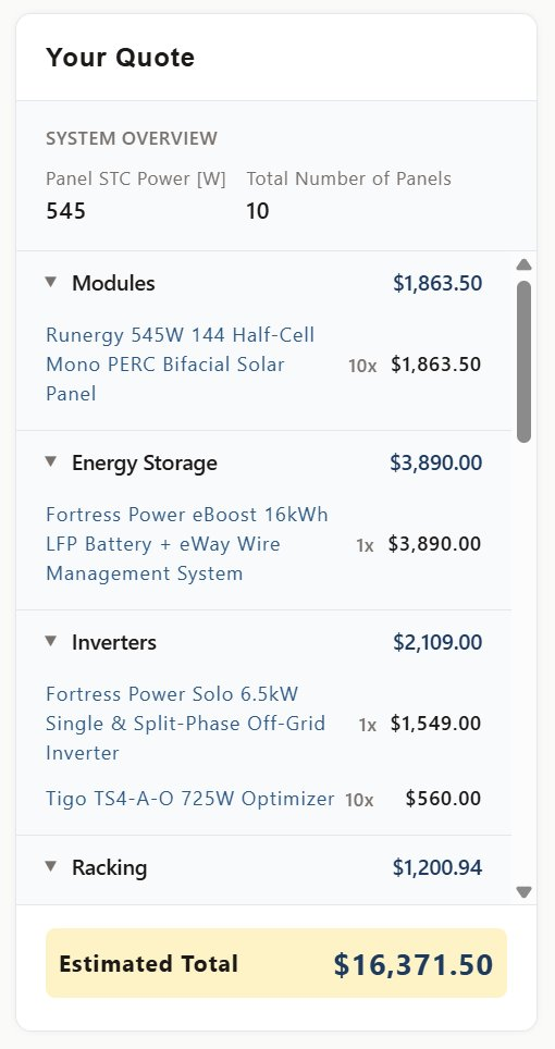
Throughout the wizard, the sidebar builds the bill of materials in real time:
- Categories appear as the customer reaches each step.
- Quantities update instantly on every selection.
- Items are grouped by category with subtotals.
- You control what shows here from Quote Display.
The quote page
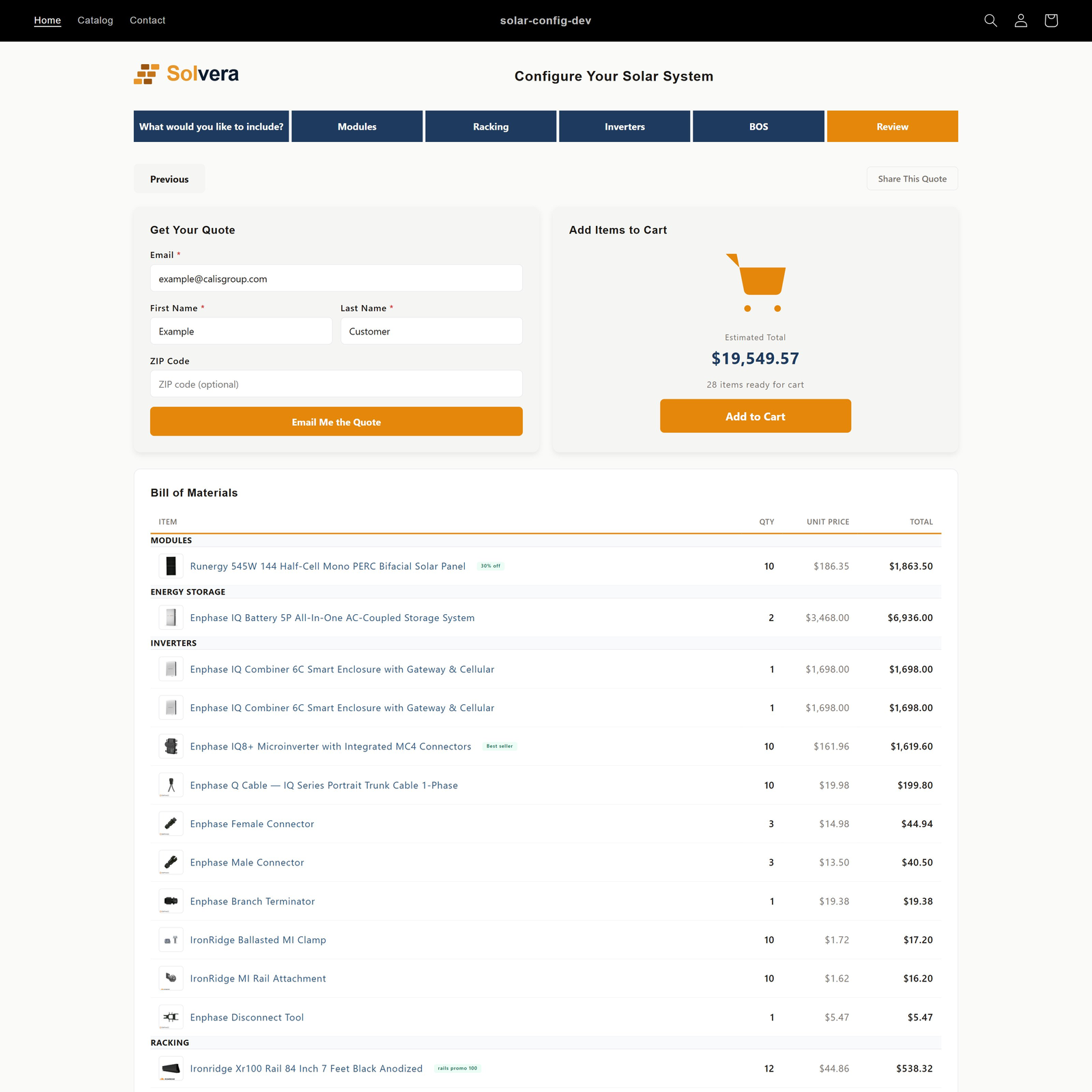
The final step is a full page quote:
- A grouped bill of materials table with category subtotals.
- Promotional badges on any flagged items, a "Minimum order: N" badge on a panel row raised to its minimum, and a module icon on each category header.
- A pricing breakdown (subtotal, surcharges, shipping, tax, estimated total) when pricing is configured.
- Three action cards side by side above the table (the email and share cards appear based on your Quote Delivery settings):
- Email your quote: a logged-in customer sees their address masked, for example "We'll send it to m***@example.com", and clicks Email my quote. There is nothing to type. A logged-out visitor sees Log in to email your quote; clicking it saves the quote, shows a saved quote link, and routes through the store's native login or signup. If you enabled it in Quote Delivery, an optional ZIP or postal code field sits in this card.
- Add to cart: shows the items subtotal, or the estimated total once you have configured Quote Pricing, with an Add to Cart button that pushes the whole system to the Shopify cart for normal checkout. If Shopify rejects some lines, the rest are added and the card lists what could not be added.
- Share this quote: copy a link or send the quote by email or WhatsApp.
Each of these is recorded against the quote, so the merchant can see in the admin whether a quote was emailed, shared, viewed, or added to cart. See what Solvera tracks for each quote.
Branding
If you are on the Professional plan and have applied branding, the customer sees your logo at the top of the configurator and your accent and secondary colors throughout. The confirmation email uses the same branding. Professional